SkinnyPop Microwave Boxes
Overview
A rebrand doesn’t end with a new visual identity. The new look needs to work across a brand’s products, packaging formats, and real-world production requirements to make it to the shelf.
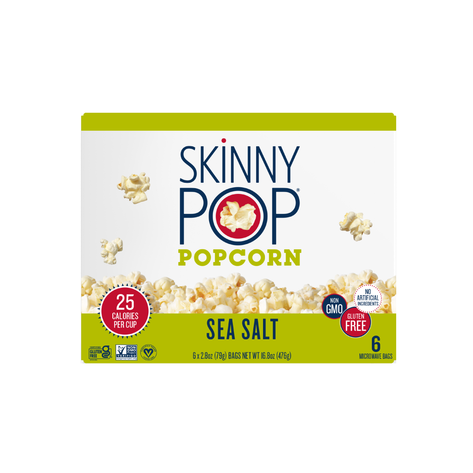
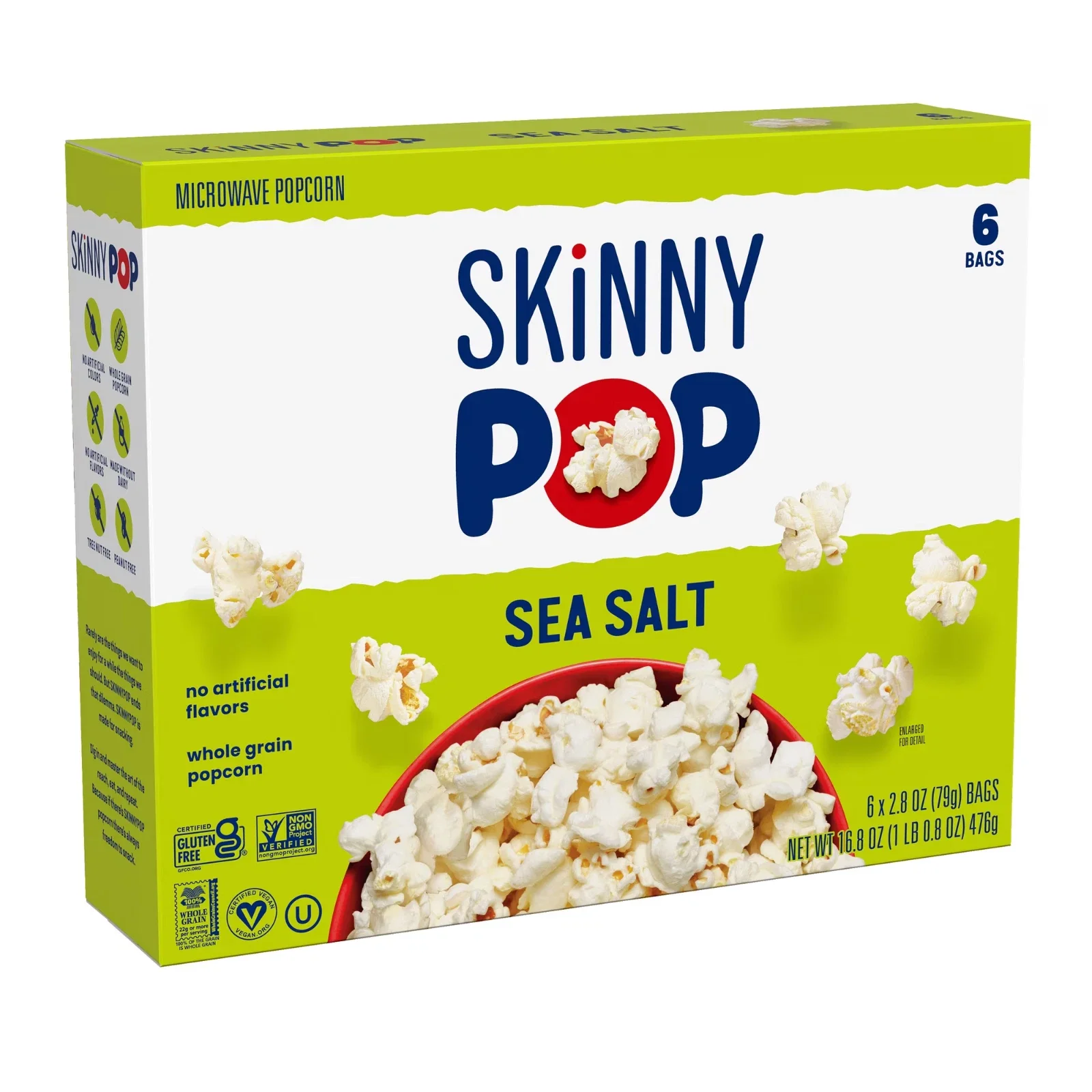
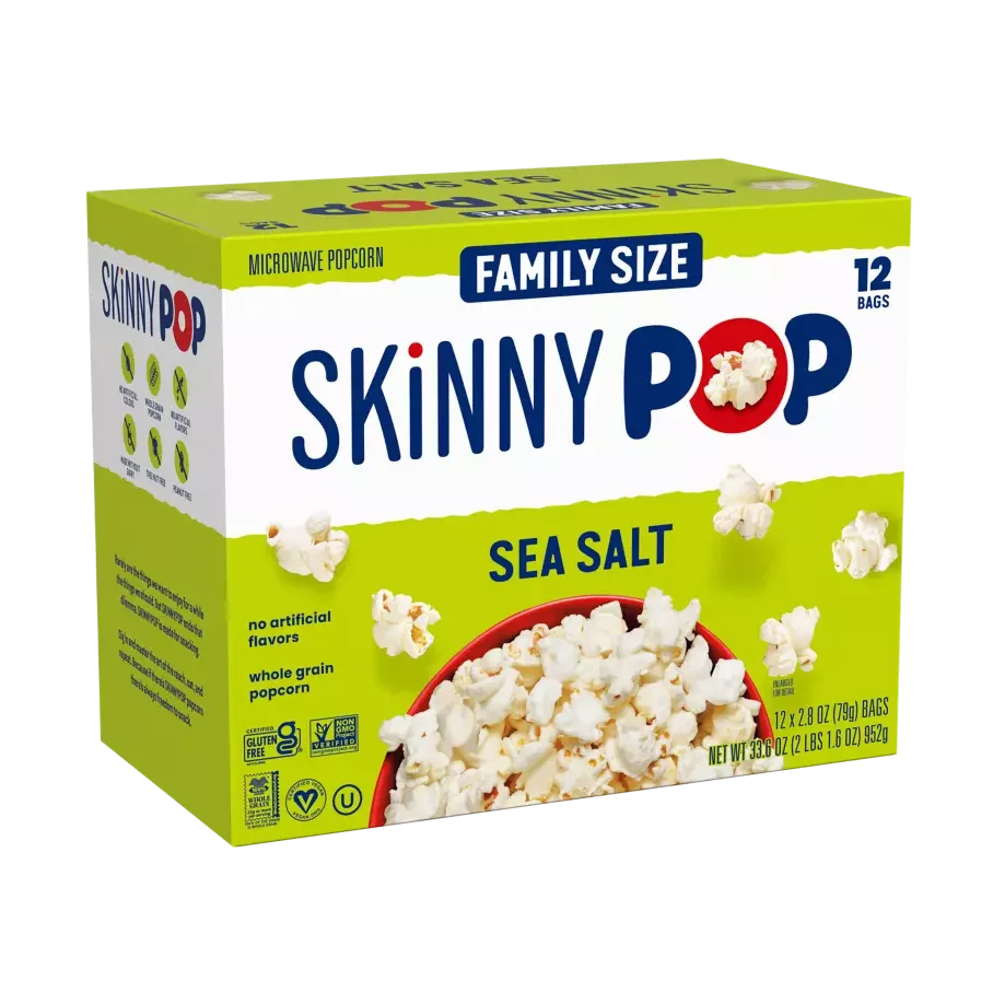
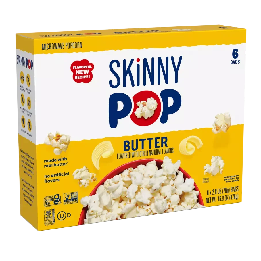
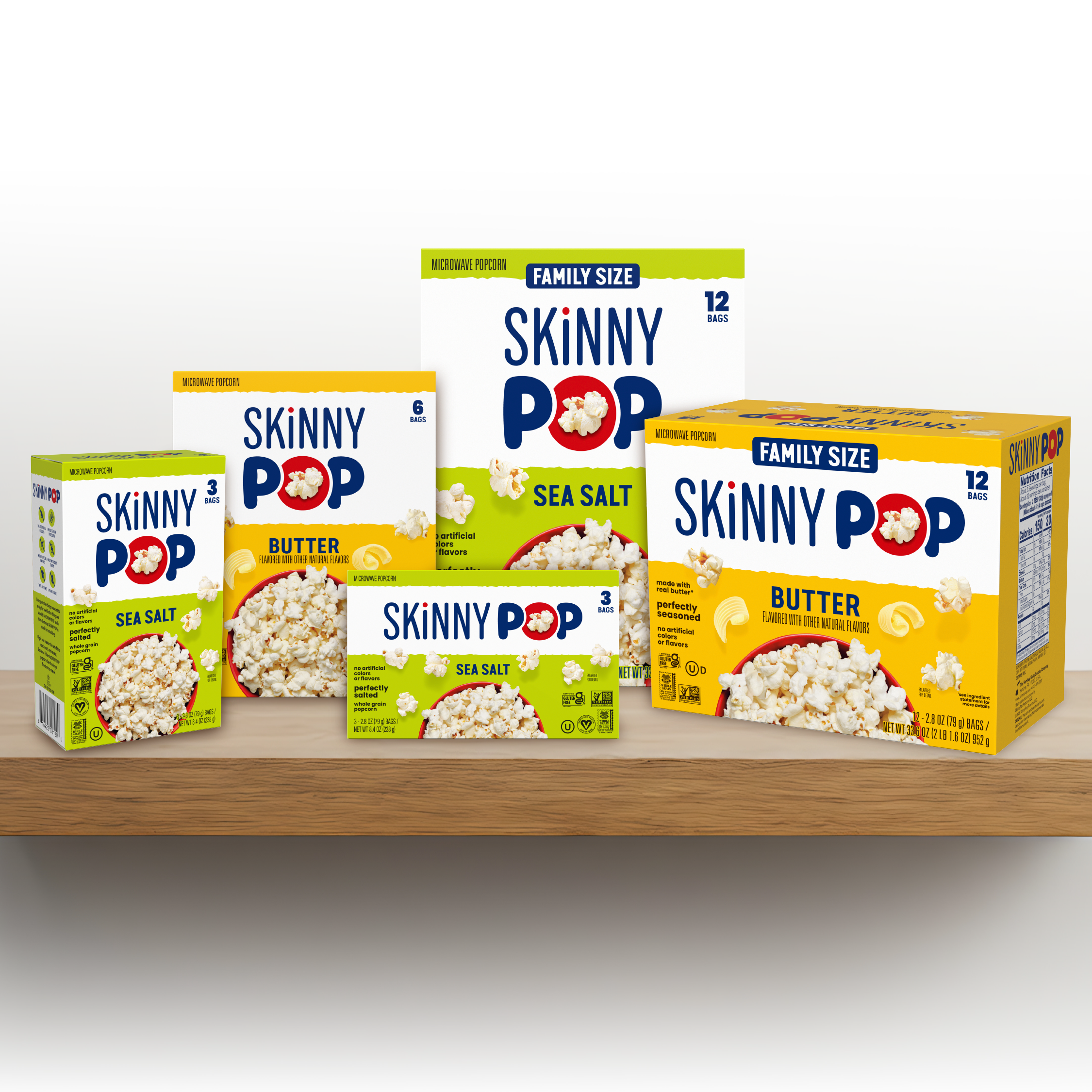
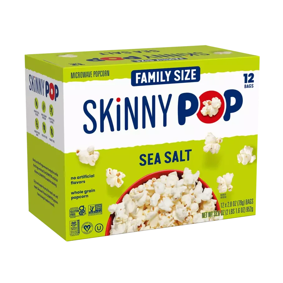
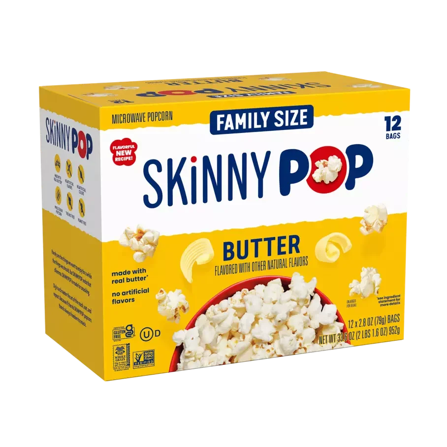
SkinnyPop introduced a new Visual Identity System, and its microwave popcorn packaging needed to be updated to match. I worked on adapting the new design across the Sea Salt and Butter varieties in 3-count, 6-count, and 12-count boxes. The concept needed more than a simple design update; it required a thoughtful adaptation to a different package format, with layouts and artwork developed to meet print-production requirements.
I translated the new brand identity into a cohesive packaging system, balancing brand consistency, product information, and shelf visibility while preparing the artwork for production across all six versions.
Challenges & Problem Solving
1. Translating the New Identity to a Different Format
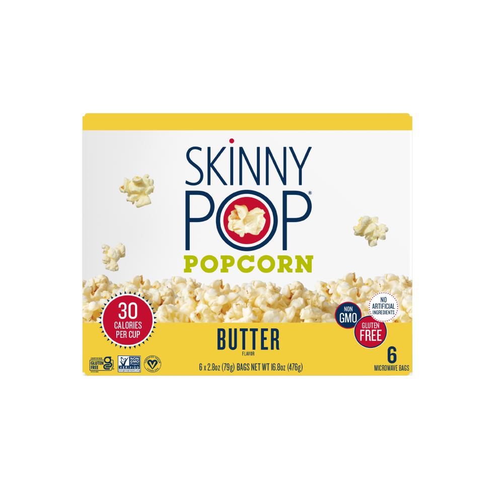
The visual identity was developed for ready-to-eat bags, so the existing design concept did not directly translate to microwave boxes. I adapted the layout and visual hierarchy to suit the box format while preserving the recognizable SkinnyPop identity.
2. Designing for Multiple Package Sizes and Orientations
The boxes needed to work across three sizes and could be displayed horizontally or vertically. I developed layouts that accommodated both orientations while maintaining clear product information and brand recognition.
3. Preparing the Rebrand for Production
The supplied concept was not production-ready and needed further development before it could move into print. I refined the artwork and layout to account for the packaging format, production requirements, and differences between SKUs, creating consistent, production-ready files across the range.
Packaging Deliverables
Total Production Files: 6
Sea Salt Microwave Popcorn
3-count box
6-count box
12-count box
Butter Microwave Popcorn
3-count box
6-count box
12-count box
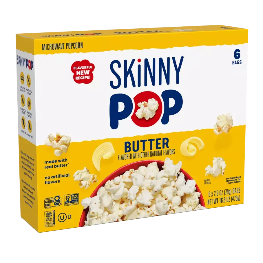
Before and After