Building a bold, recognizable brand for a local service business.
Weaver’s Pressure Washing needed a brand that felt professional, energetic, and approachable while standing out in a competitive local market. I began by researching other pressure washing businesses and reviewing visual styles the client was drawn to, using those insights to establish a direction for the brand.
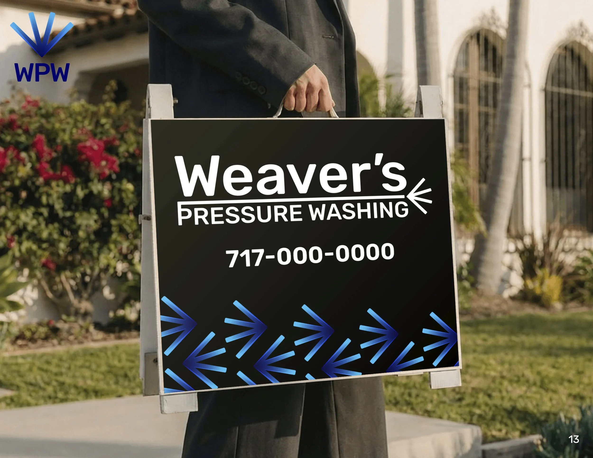
From there, I developed three distinct logo concepts for the client to evaluate. Once a direction was selected, I refined the identity into a complete brand system designed to work consistently across everything from trucks and uniforms to digital applications and printed materials.
My Process
-
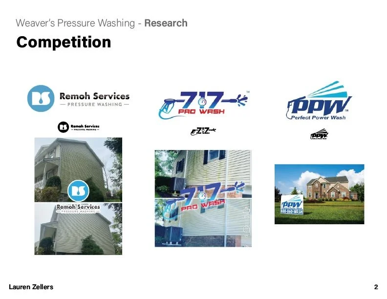
Researched local pressure washing competitors and their visual identities
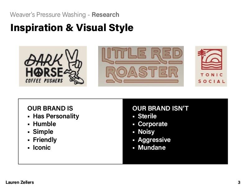
Reviewed existing brands and design references the client responded to
Identified opportunities for Weaver’s to have a distinctive visual presence
-
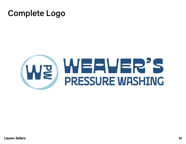
Developed three initial logo concepts with different visual approaches
Presented the concepts for client feedback and selection
Refined the chosen direction into a cohesive identity
-
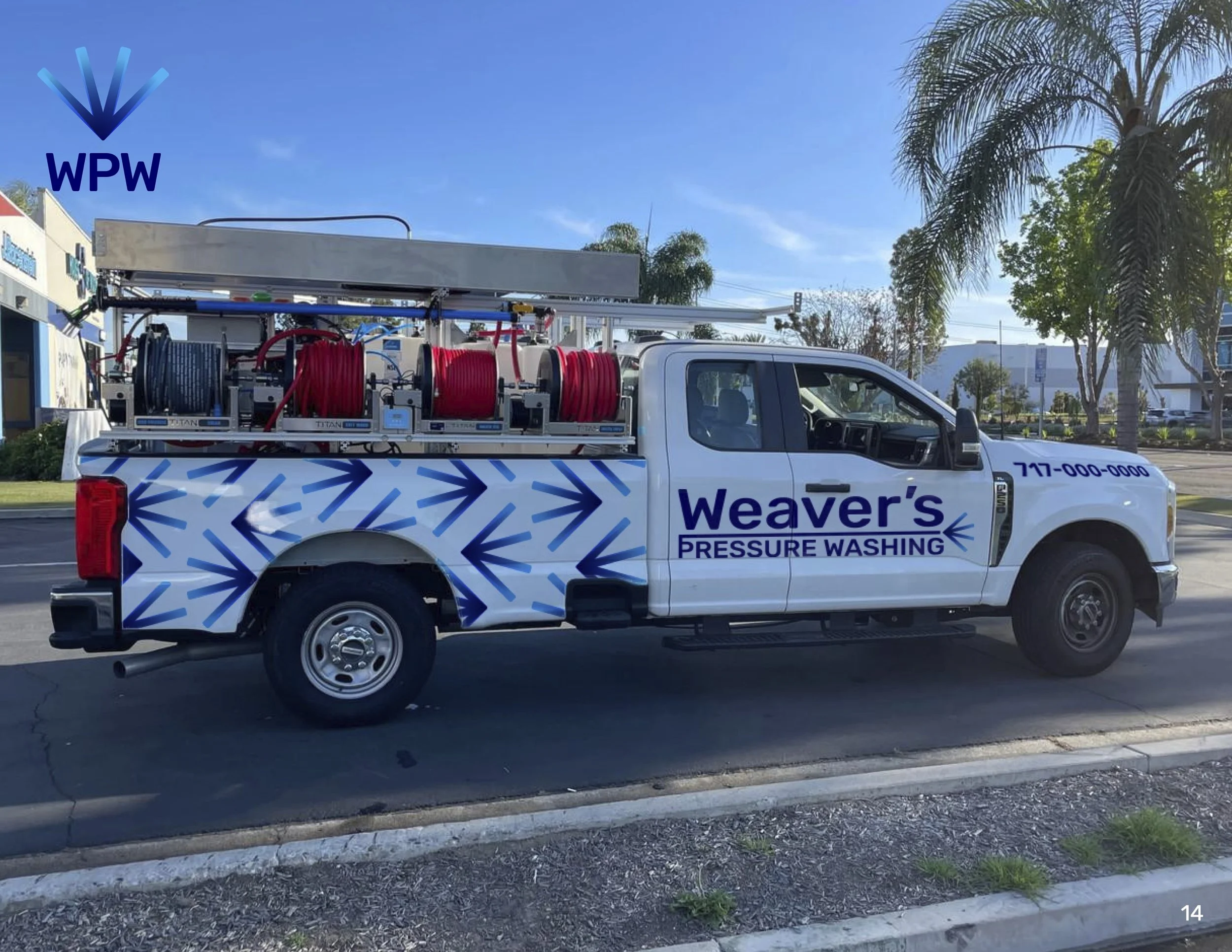
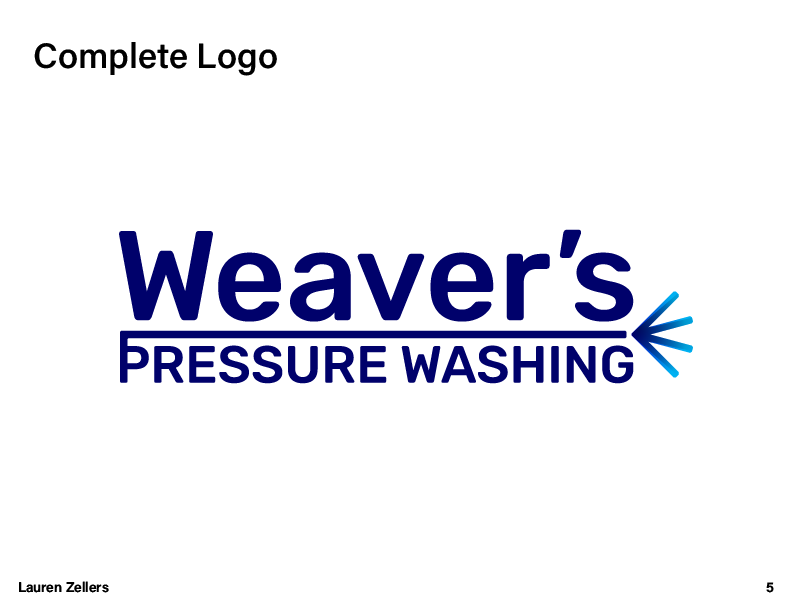
Created the primary Weaver’s Pressure Washing brand mark
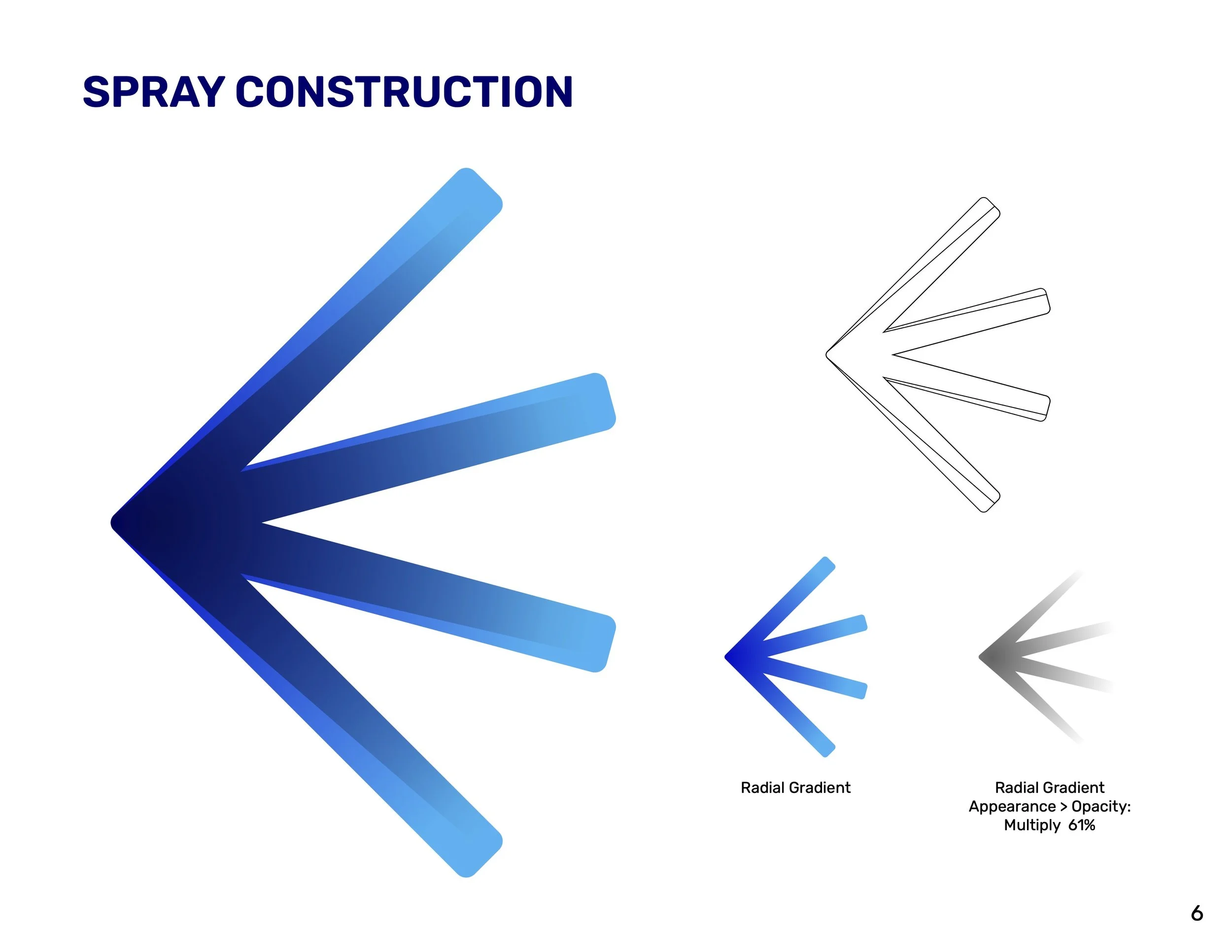
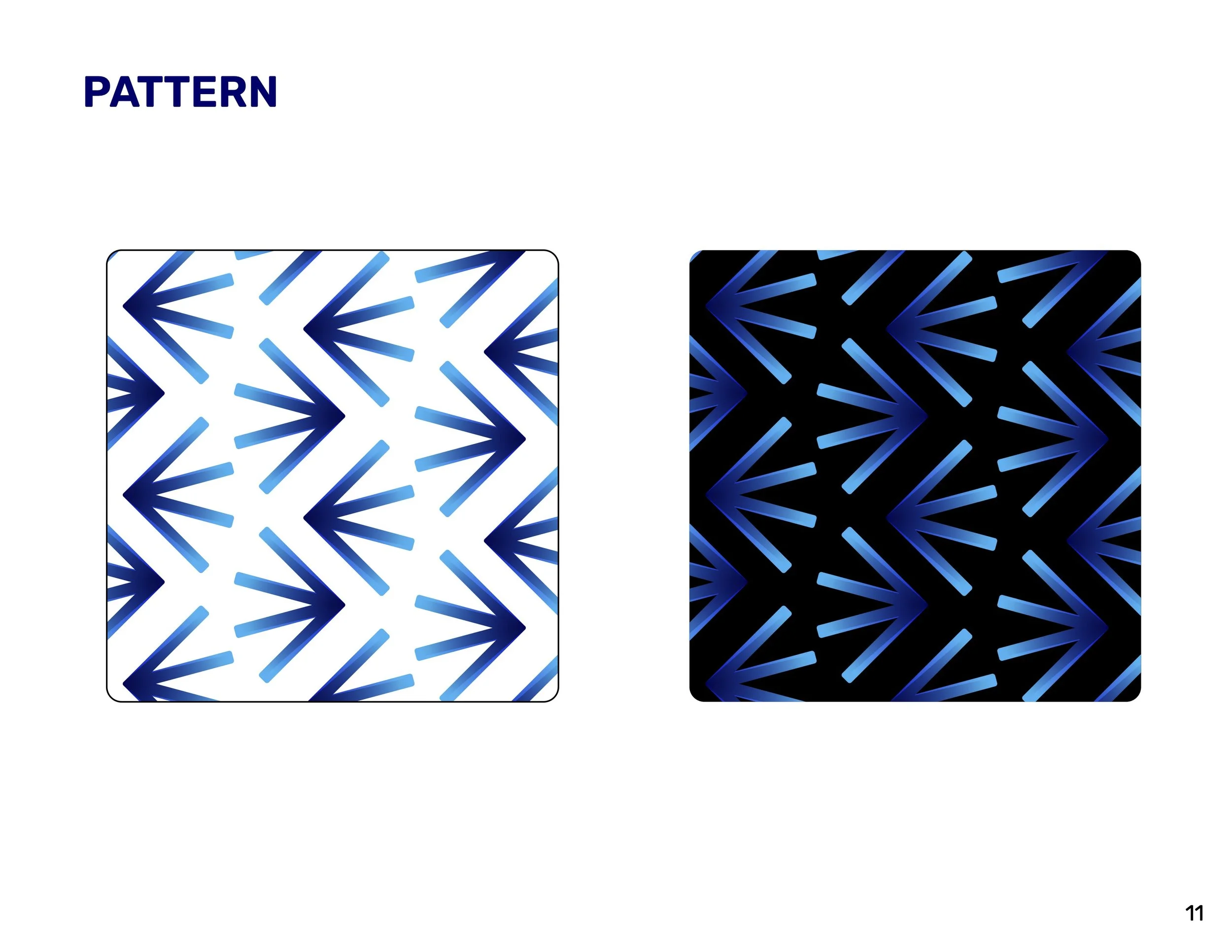
Developed the spray graphic as a distinctive visual element
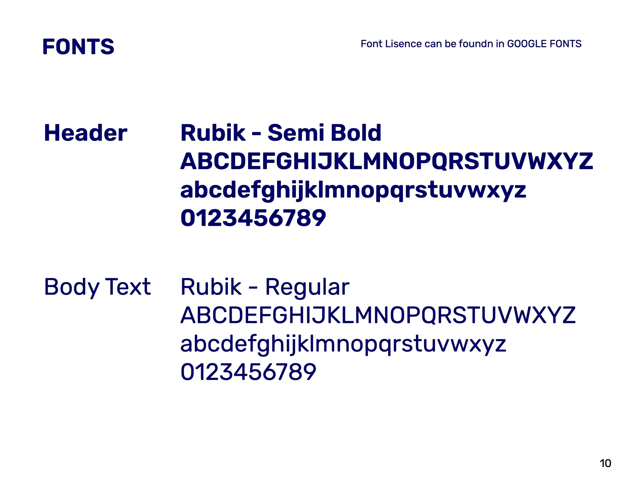
Established the relationship between the wordmark, pressure washing descriptor, and spray mark
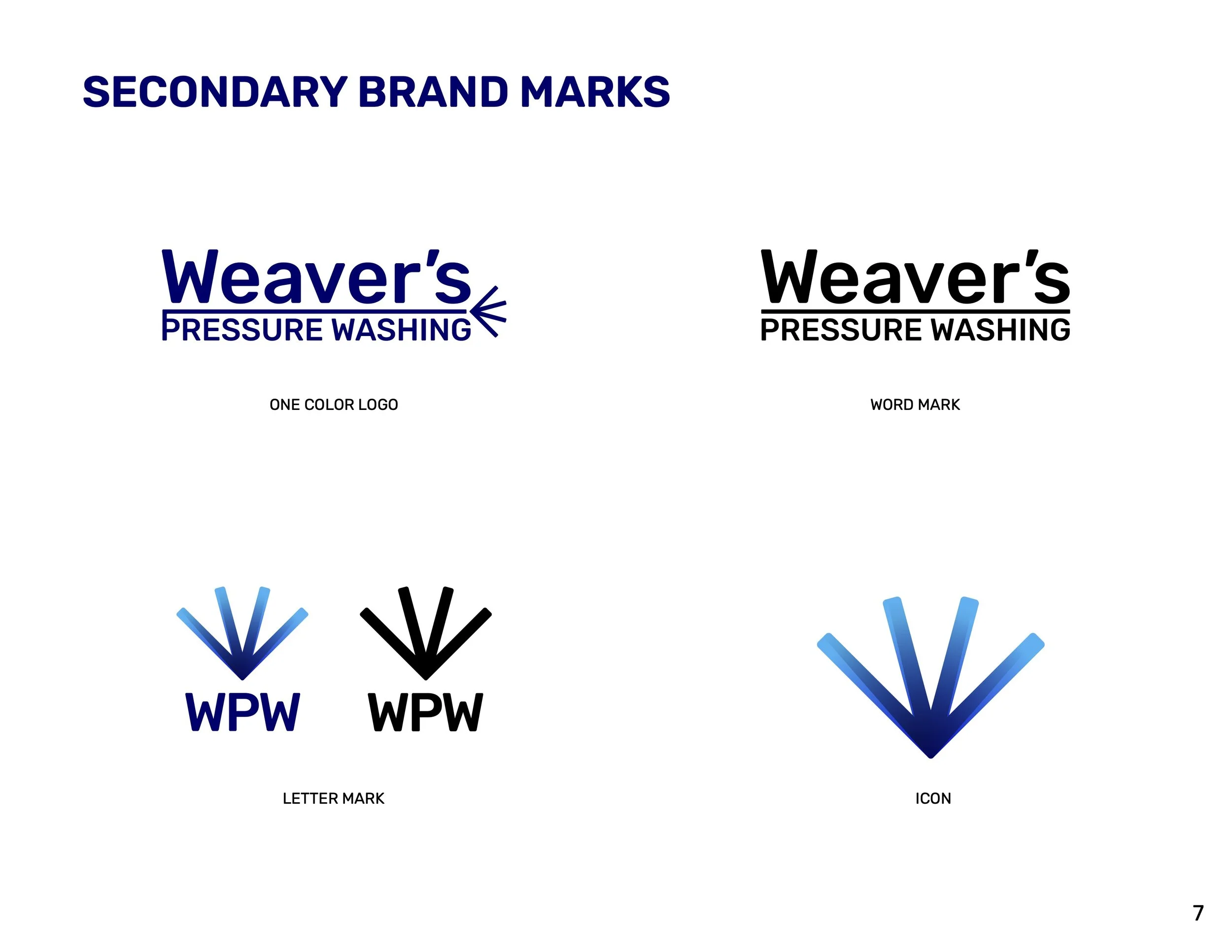
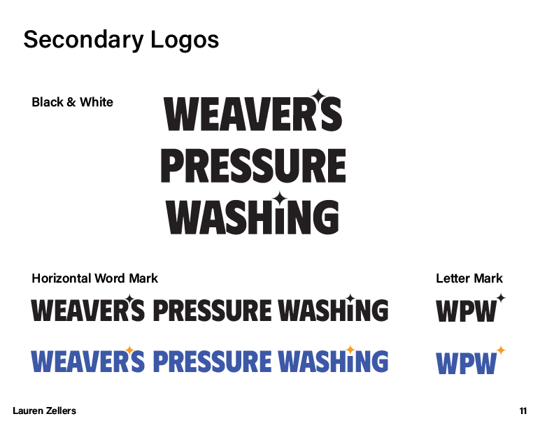
Created secondary logo variations, a letter mark, and standalone icon
-
Defined logo construction and proportions
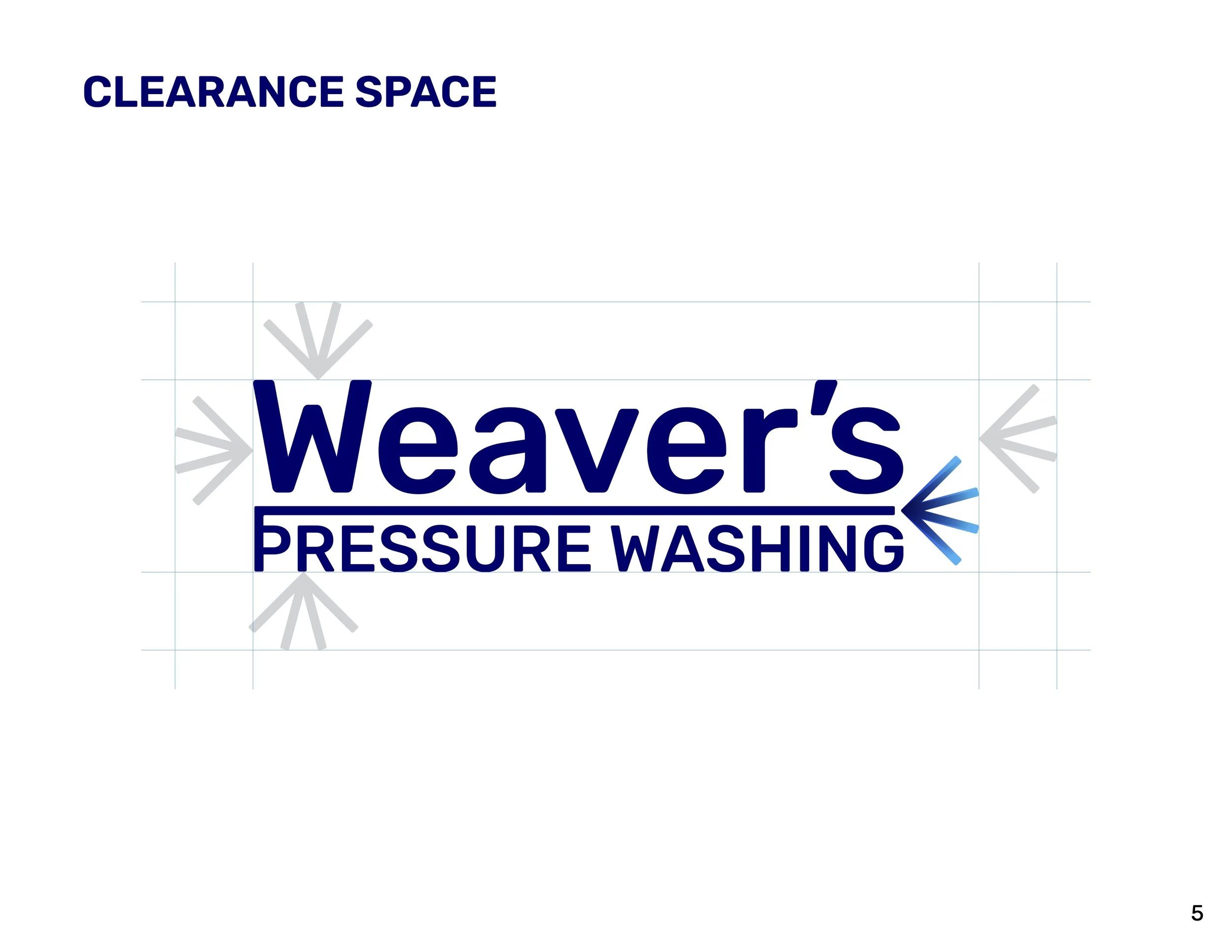
Established clear space requirements
Documented the construction of the spray element
Created guidelines for primary and secondary brand marks
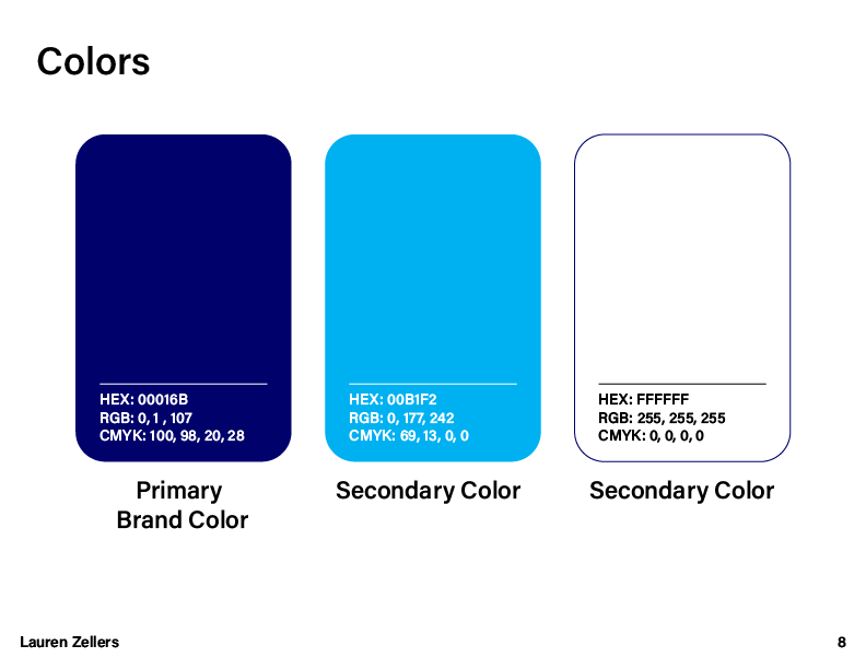
Prepared the identity for consistent use across different applications
-
Exported the complete identity in the formats needed for print and digital applications
Provided variations suitable for different sizes, backgrounds, and use cases
Organized the final assets so the brand could be used consistently by the client and future vendors

Research & Discovery
Three Concepts
Concept 1


Concept 2



Concept 3


Final Brand
Guidelines